REVIEW: Nothing Phone (3) – Flashy and Fun, But Is It Enough?
Nothing says it’s on a mission to “make tech fun again”. The five-year-old British brand, helmed by OnePlus co-founder Carl Pei, has quickly made a name for itself in a sea of lookalike smartphones.
With striking transparent designs and a growing community of loyal fans, they’ve built their identity around bold aesthetic choices. But as Nothing steps into the big leagues with its “first true flagship”, the Nothing Phone (3), the question is: are they being different for the sake of it, or does this phone really deliver?
Just like the new Nothing Headphones (1), the Phone (3) makes a statement from the moment you see it.
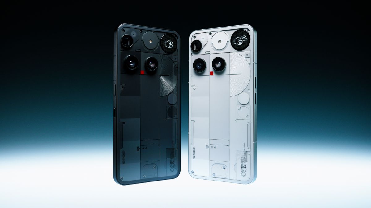
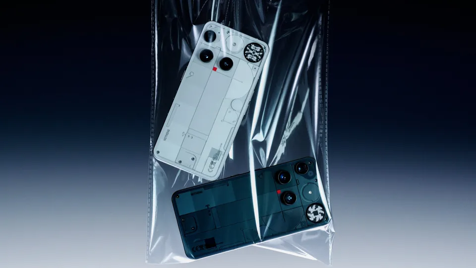
The design is a bit ‘Marmite’ – you’ll either love it or hate it. I’ve always admired Nothing’s products from afar through their moody, avant-garde, retro-futuristic aesthetic on social media. But despite all the slick marketing speak – e.g. a “tri-column layout inspired by urban architecture”, an ultra-slim 1.87mm bezel and a recycled aluminium frame – the illusion wavered the moment I held it.
There’s something underwhelming about the texture of the back. I was expecting satisfying ridges or tactile grooves, but instead it feels a bit like the phone is wearing a weird cheap case. It just doesn’t feel premium. Not to mention the phone feels pretty heavy.
Compared to Motorola’s latest offerings for example, phones that feel genuinely nice in the hand, the Nothing Phone (3) doesn’t quite match up. Unlike the Headphones (1), which seem to nail the details better.
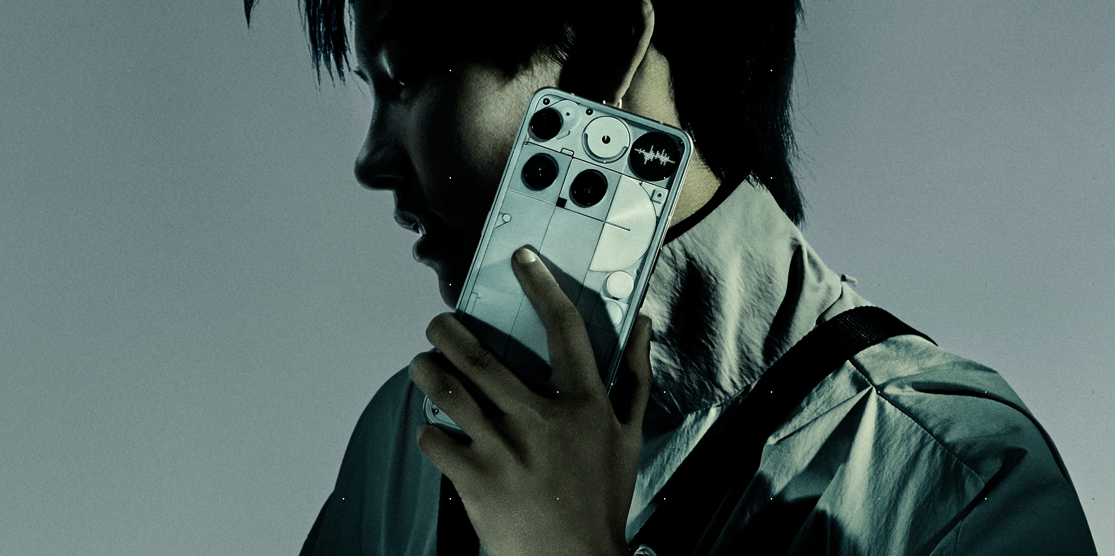
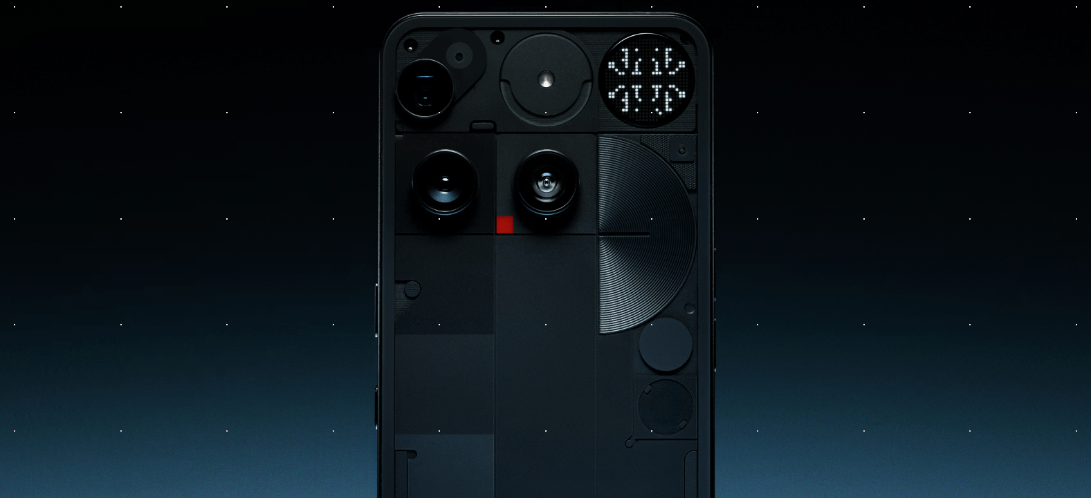
What does feel high-end, or at least unique, is the new Glyph Matrix – a low-fi micro-LED array on the back that’s designed to reduce screen time.
It can show priority info like the time, incoming calls, or app notifications while your phone stays face-down. Users can even assign custom icons to contacts, showing pixelated avatars when messages arrive.
There are also quirky touches like a Magic 8 Ball or a “spin the bottle” game – though how long those novelties stay entertaining is questionable. A nice addition is the Glyph Developer Kit, launched last year, which lets developers make their own animations and share them with the Nothing community.
It’s that kind of thinking that runs through the whole NothingOS experience. The interface is minimalist, dark, and even retro in some ways, evoking the feel of early LCD devices with purposeful design and sound choices.
It’s a refreshing break from the visual overload of many Android skins. Nothing’s productivity-focused AI hub, Essential Space, is satisfying and genuinely useful with smart tools for saving notes, images, voice memos and getting back to them later via Essential Search.
There’s a new Essential Button on the side that can be programmed to access content, take voice notes or open your Essential Space with a single press. It’s a nice tactile addition which, unlike the Glyph Matrix, feels immediately practical.
Under the hood, however, things get a tad murky.
Despite the hype around this being their first true flagship, the Phone (3) runs on Qualcomm’s Snapdragon 8s Gen 4, not the more powerful Snapdragon 8 Gen 4 Elite – a controversial decision in the tech community.
At A$1509, this puts it in the same premium bracket as Samsung’s Galaxy S25 or Apple’s iPhone 16 base models.
While you do get good value in some areas, like the quad-camera setup featuring a 50MP main sensor, 3x periscope zoom, and solid computational photography powered by the TrueLens Engine 4, there’s still a sense it’s slightly behind the top-tier crowd.
Camera performance is strong, particularly in daylight and for social media-ready shots. Ultra XDR video, accurate skin tones, and multi-focal portrait modes give creators something to work with, but this isn’t a category-leading camera experience just yet. Four lenses is a bit overkill visually, like a little camera colony, but it’s functional and you stop noticing it after a while.
Battery life is another win. You’ll get a full day with ease and often more. And of course there’s wireless charging and decent fast-charging support to keep you topped up.
Ultimately, the Nothing Phone (3) is a device of contradictions. It’s genuinely interesting, with thoughtful features and a distinct design language. Yet parts of it are underwhelming like the lack of real tactility in the body or the decision to use a slightly lesser processor than expected.
For all its talk of changing how we use phones, you still end up using it like any other Android device after a while – though I am a big fan of the interface aesthetic.
For Nothing, that might be enough. As Nothing’s global marketing director Hollie Bishop told us at a recent Sydney launch event: “Design should make you feel something – if it doesn’t, then we’re doing something wrong.”
There’s no denying the Phone (3) does just that. Whether it’s joy, confusion or just curiosity, this phone makes you feel something.
If you’re a few years behind in the phone market and want something genuinely fresh and different, the Nothing Phone (3) is a compelling choice. But if you’re already rocking a recent iPhone or Galaxy flagship, Nothing’s latest might not justify the switch just yet, unless you simply want to stand out from the crowd.
Pros
-
Glyph Matrix is functional and playful
-
Clean, minimal Nothing OS interface
-
Useful Essential Space and Essential Button
-
Solid all-round camera system with creative tools
-
Strong battery life with wireless and fast charging
Cons
-
Snapdragon 8s Gen 4 isn’t flagship-grade
-
Doesn’t feel as premium in-hand as rivals
-
Price matches high-end phones without quite matching performance